Most personal finance apps bury you in data. Ledger was designed around a different premise: that clarity is more valuable than completeness.
UX Design • Data Visualization • Internal Tool Redesign
01 — THE PROBLEM
Personal finance tools tend to fall into one of two traps: they are either too simple to be useful, or so data-dense that users stop checking them after the first week. The real problem is not a lack of information. It is a lack of signal. Users do not need to see every transaction. They need to know if they are on track, and what to do when they are not. Ledger was designed to answer three questions clearly: How am I doing this month? Am I making progress on my goals? What should I do differently?
02 — DESIGN PRINCIPLES
Before a single screen was designed, three principles were established to guide every decision:
CALM OVER COMPLETE Show less, mean more. Every element on screen must earn its place. If removing it does not change the user's understanding, it gets cut.
NUMBERS ARE THE HERO Financial figures should dominate visually. Typography is the primary design tool, not color, not illustration.
PROGRESS OVER PRECISION Feeling on track matters more than knowing the exact figure to the cent. The design prioritizes trajectory and momentum over granular accuracy.
These principles were the lens for every layout decision, every chart choice, and every moment where more data could have been added but was not.
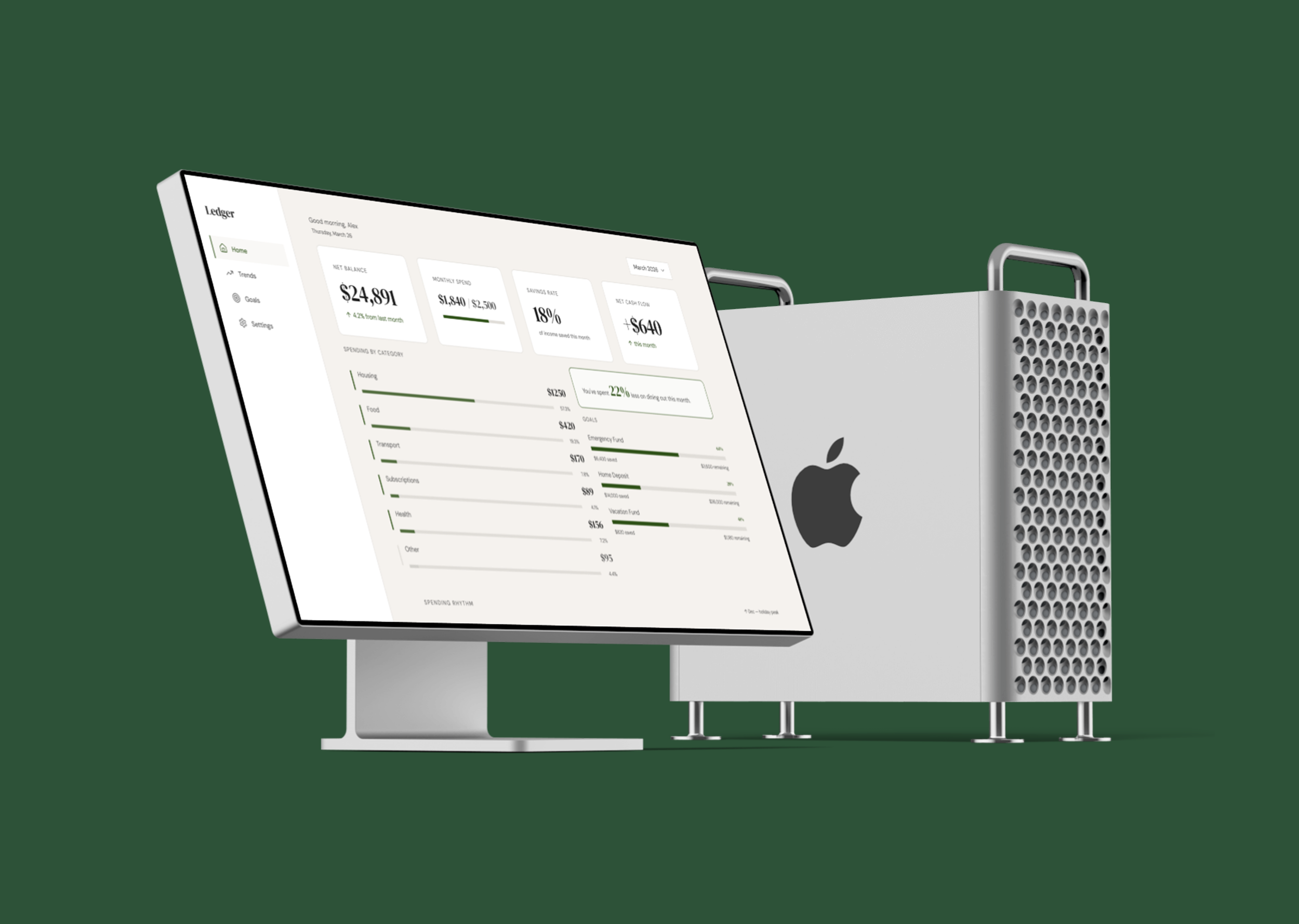
03 — THE SCREENS
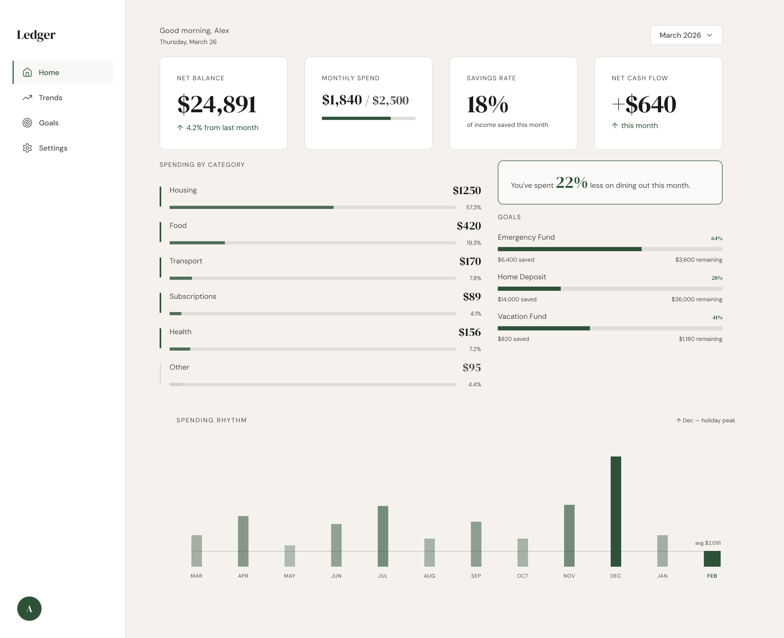
The home screen answers the first question, how am I doing this month, in a single composed view.
Four metric cards establish the financial snapshot at a glance. Below them, a category breakdown table uses inline proportion bars rather than a separate chart, keeping the data dense but readable. The Spending Rhythm chart at the bottom replaces a standard line chart with a vertical pulse strip, a deliberate choice to make 12 months of data feel like a pattern rather than a plot.
KEY DECISION: The Spending Rhythm chart A standard bar or line chart would have worked. The rhythm strip was chosen because it communicates behavioral pattern rather than precise values, which is more useful for a user trying to understand their habits than their exact December figure.
03 — THE SCREENS
The home screen answers the first question, how am I doing this month, in a single composed view.
Four metric cards establish the financial snapshot at a glance. Below them, a category breakdown table uses inline proportion bars rather than a separate chart, keeping the data dense but readable. The Spending Rhythm chart at the bottom replaces a standard line chart with a vertical pulse strip, a deliberate choice to make 12 months of data feel like a pattern rather than a plot.
KEY DECISION: The Spending Rhythm chart A standard bar or line chart would have worked. The rhythm strip was chosen because it communicates behavioral pattern rather than precise values, which is more useful for a user trying to understand their habits than their exact December figure.
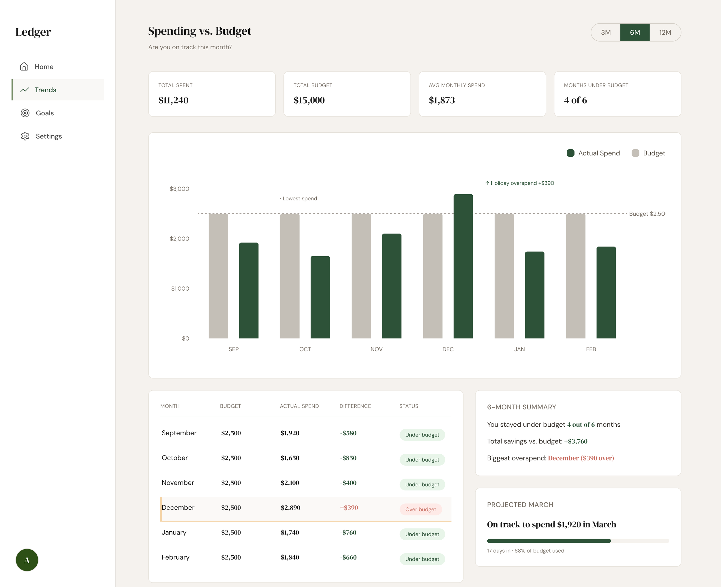
Trends: Spending vs. Budget
The Trends screen answers a more specific question: am I on track against my budget over time?
A dual-layer bar chart plots actual spend against a fixed $2,500 monthly budget across six months. December's bar visibly exceeds the budget threshold. This is the intentional narrative anchor of the screen. Editorial annotations placed directly on the chart label the outlier and the low point, borrowing from financial journalism rather than standard tooltip conventions.
The data table below the chart functions as the analytical companion to the visual story, for users who want the precise figures after the chart has oriented them.
KEY DECISION: Annotations over tooltips Tooltips require interaction to reveal information. Annotations make the insight visible immediately, treating the most important data moments as editorial callouts rather than discoverable details.
04 — WHAT I LEARNED
This project was an exercise in restraint. The hardest design decisions were not about what to add. They were about what to leave out.
The Spending Rhythm chart went through three iterations before landing on the pulse strip format. Earlier versions used a grouped bar chart and then a small multiples approach. Both were more conventional and both communicated less.
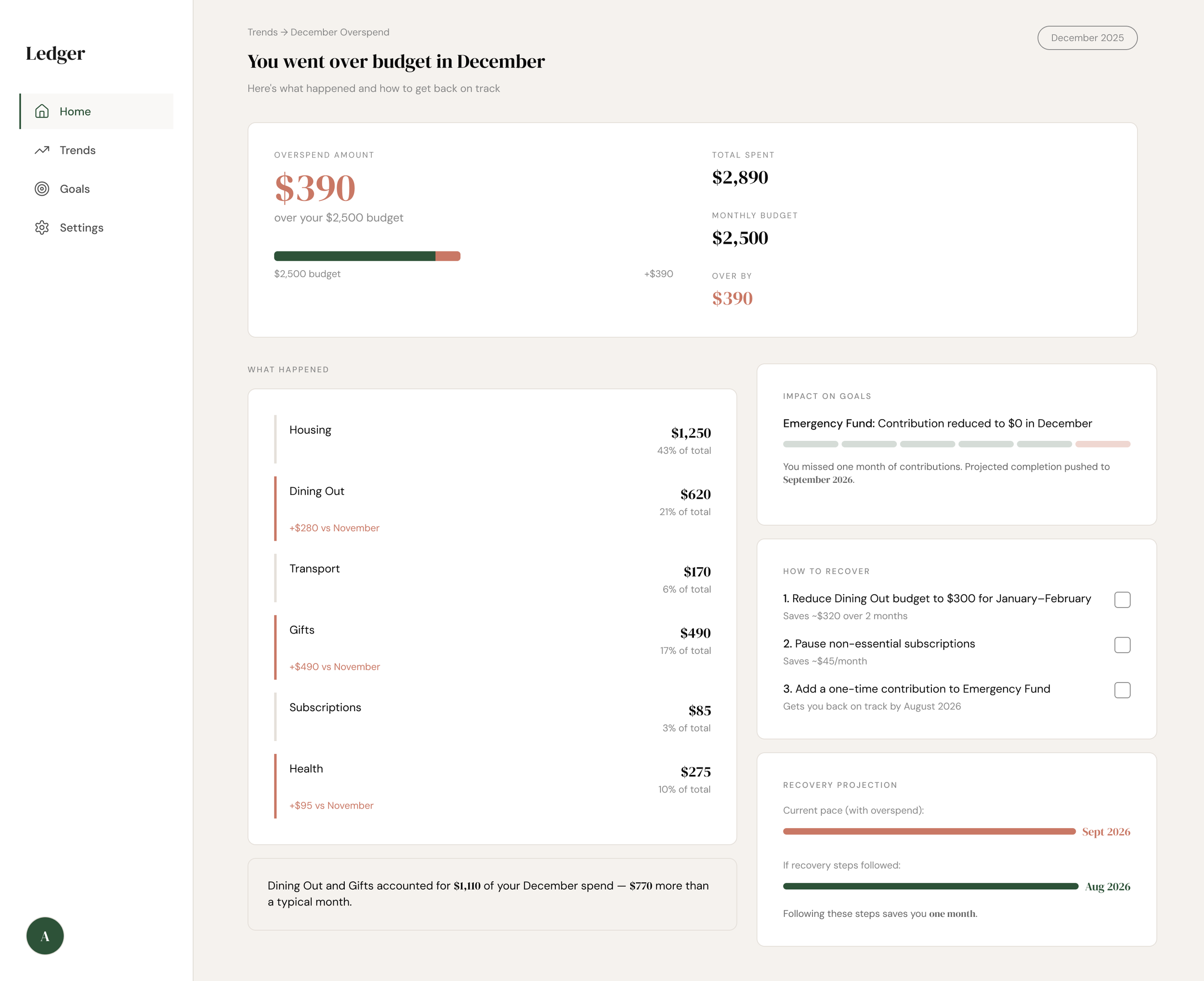
The overspend alert screen reinforced something important: the emotional register of a design matters as much as its information architecture. The same data presented in a red alert state versus a calm coral coaching state produces a fundamentally different user experience and a fundamentally different likelihood that the user takes action.
If I were to extend this project, the next screen would be a transaction-level drill-down, letting users tap a category on the overspend screen to see exactly which purchases drove the increase. That granularity belongs one level deeper, not on the surface.
05 — TOOLS AND PROCESS
Designed in Figma using Figma Make for rapid screen generation and iteration. Design system built around DM Serif Display and DM Sans, with a warm off-white base and a single forest green accent, chosen to feel editorial and calm rather than fintech-generic.