Learn Forward Annual Report
A Tiled-style interactive microsite reimagining how an e-learning platform presents its annual report — built for non-linear exploration rather than linear slide consumption.
Presentation Design • Microsite Design• E-learning

The Challenge
LearnForward is a speculative e-learning brand used to explore what an annual report looks like when it's designed as an interactive microsite rather than a presentation deck. The brief challenged me to move away from linear slide formats and instead create a non-linear experience where different stakeholder audiences — investors, educators, learners — can navigate directly to the content that matters to them.
The Insight
Annual reports are traditionally linear — you read from cover to close. But different audiences care about different things. Forcing a CFO through learner engagement stats before reaching financials is poor information design. The format needed to reflect that.
The Approach
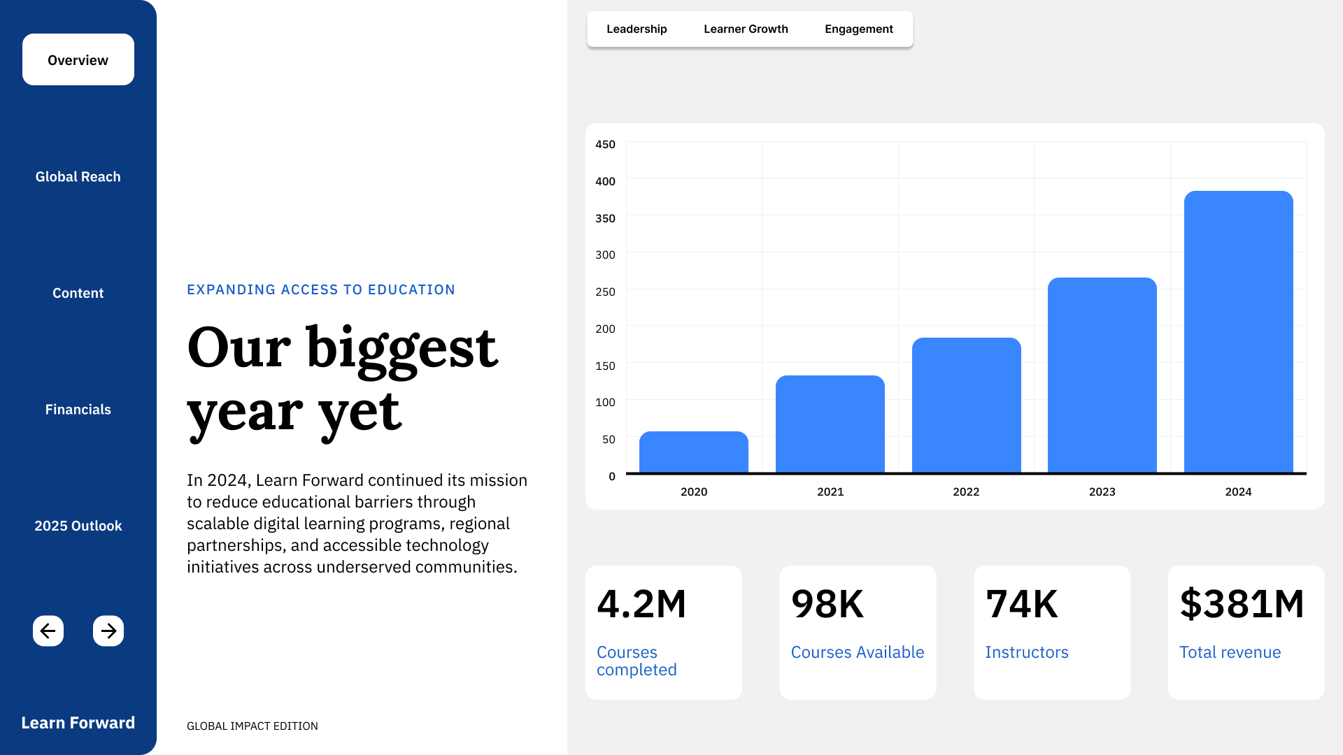
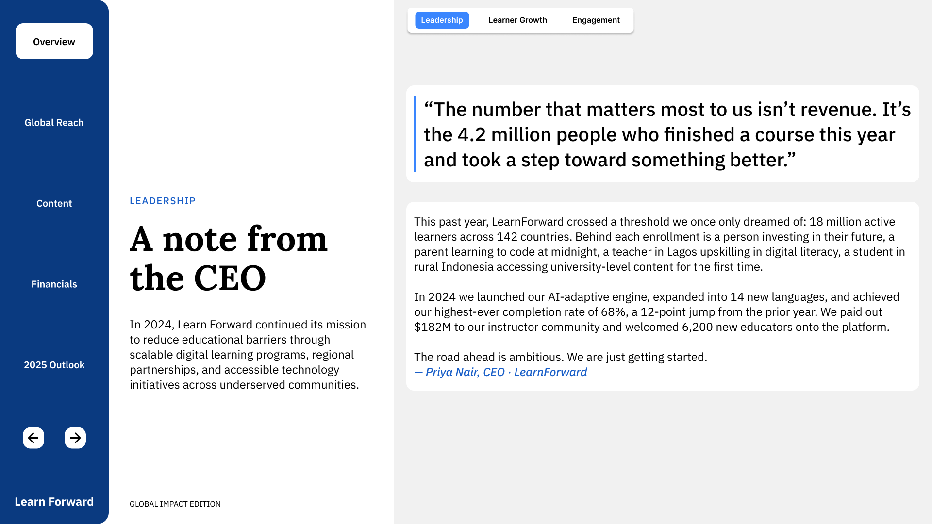
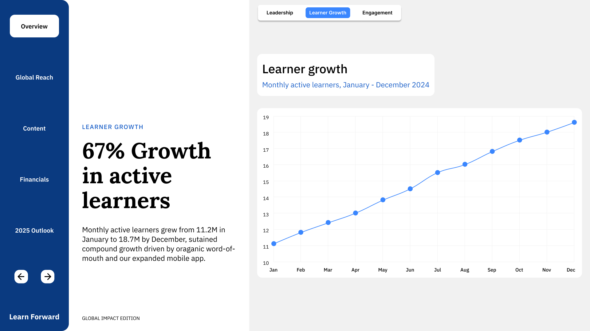
A fixed three-column shell — left nav, middle context, right content — lets users switch sections instantly while keeping orientation constant. The middle column updates its title, body copy, and key stats per section, acting as a persistent anchor between navigation and data.
Decisions
Chose a three-column persistent shell over full-page transitions — keeps users oriented and reduces cognitive load when switching between dense data sections.
Middle column acts as a consistent anchor — same position, same structure every section — so the eye knows where to look for context before engaging with the chart.
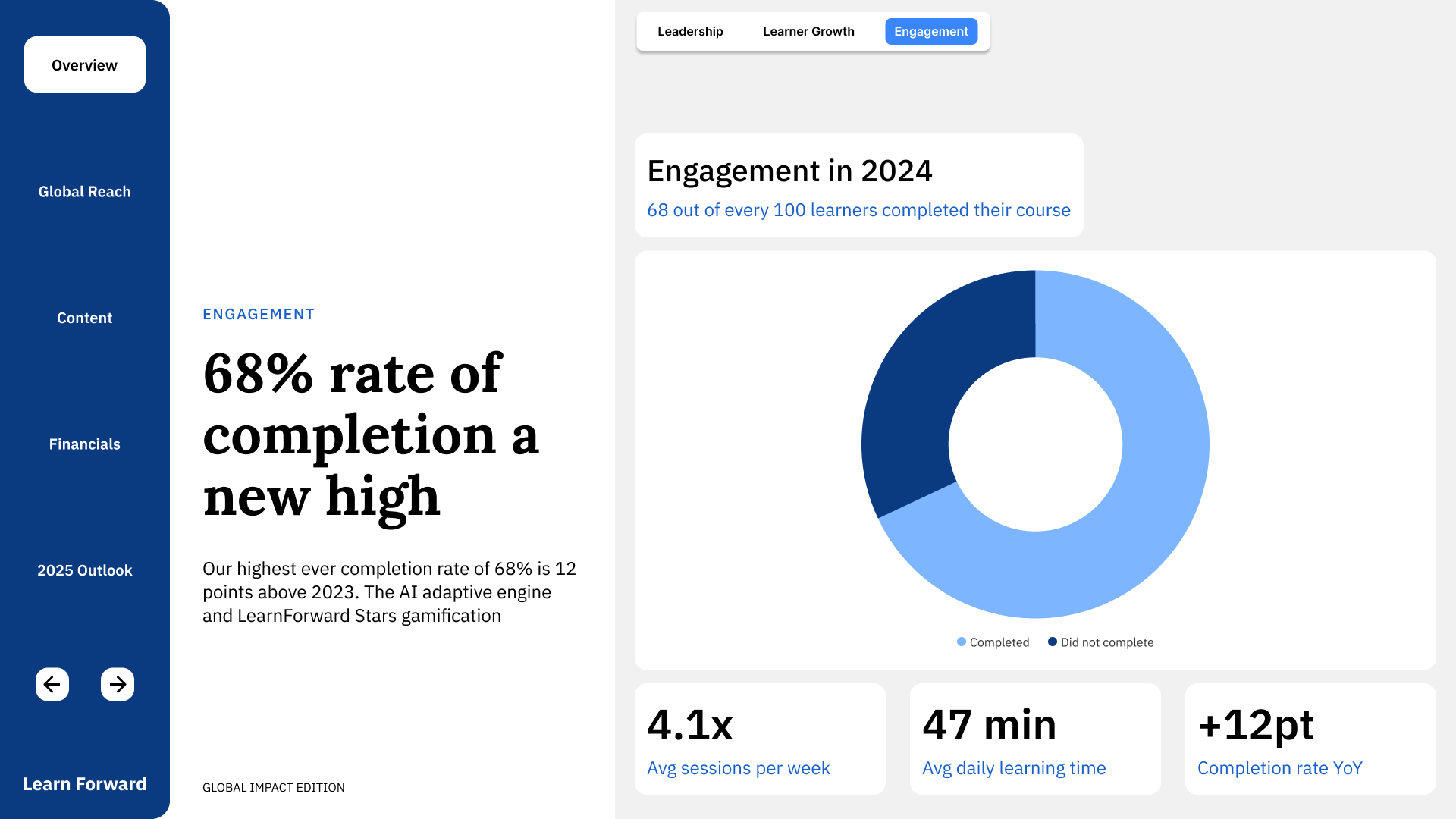
Used a dot matrix for the 68% completion rate instead of a pie or donut — 68 filled dots out of 100 is more viscerally legible than a percentage arc.
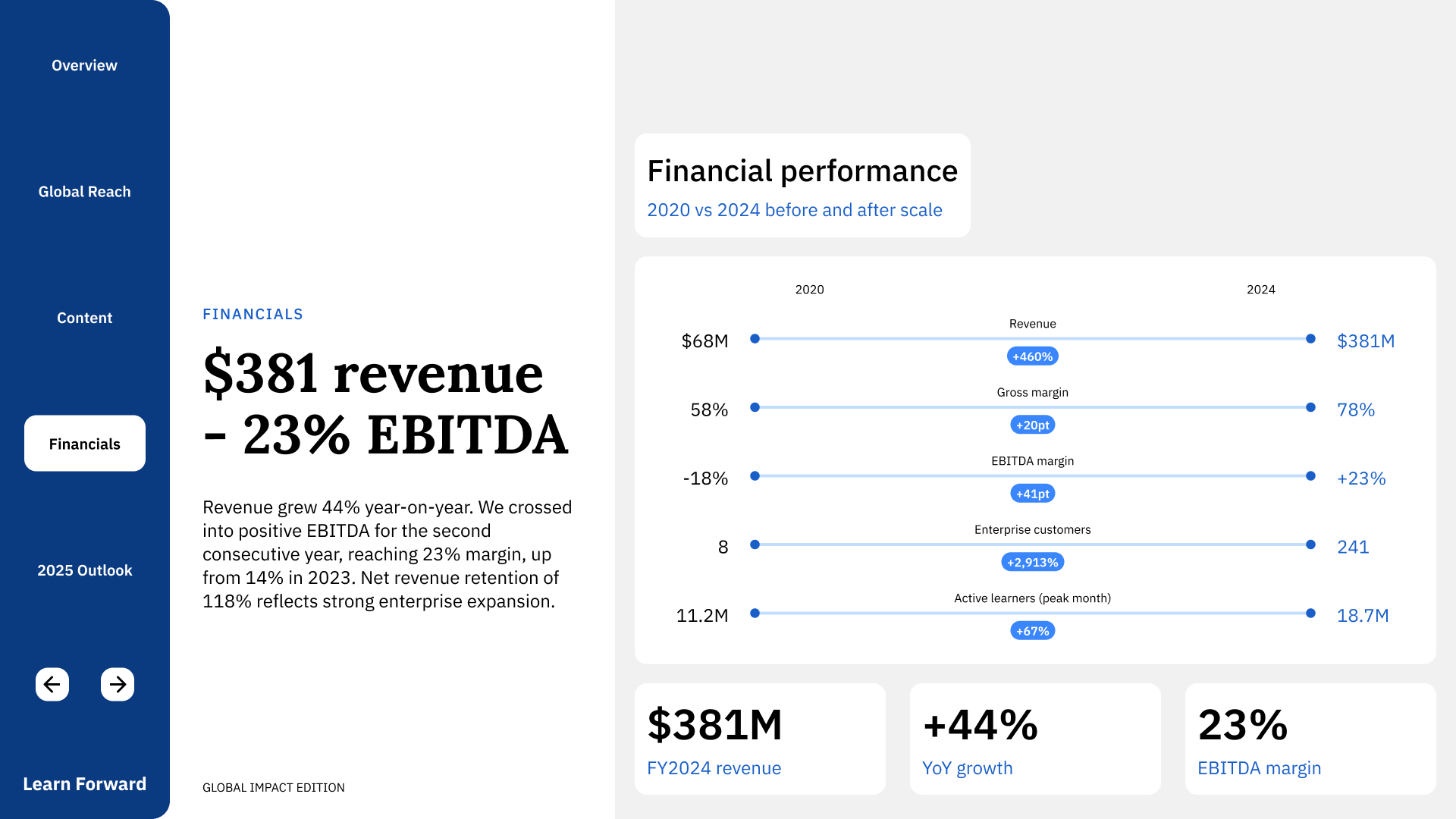
Built a slope chart for financials rather than a bar or line chart — the 2020 vs 2024 before/after framing tells the transformation story more directly than a time series.
Replaced a divergent blue/amber palette with a blue–teal analogous system — two colours that read as one family, appropriate for a report that shows growth rather than contrast.
What I Learned
This project demonstrates information architecture thinking alongside visual execution — the format itself is the argument, and every structural decision is intentional.