VitalPath
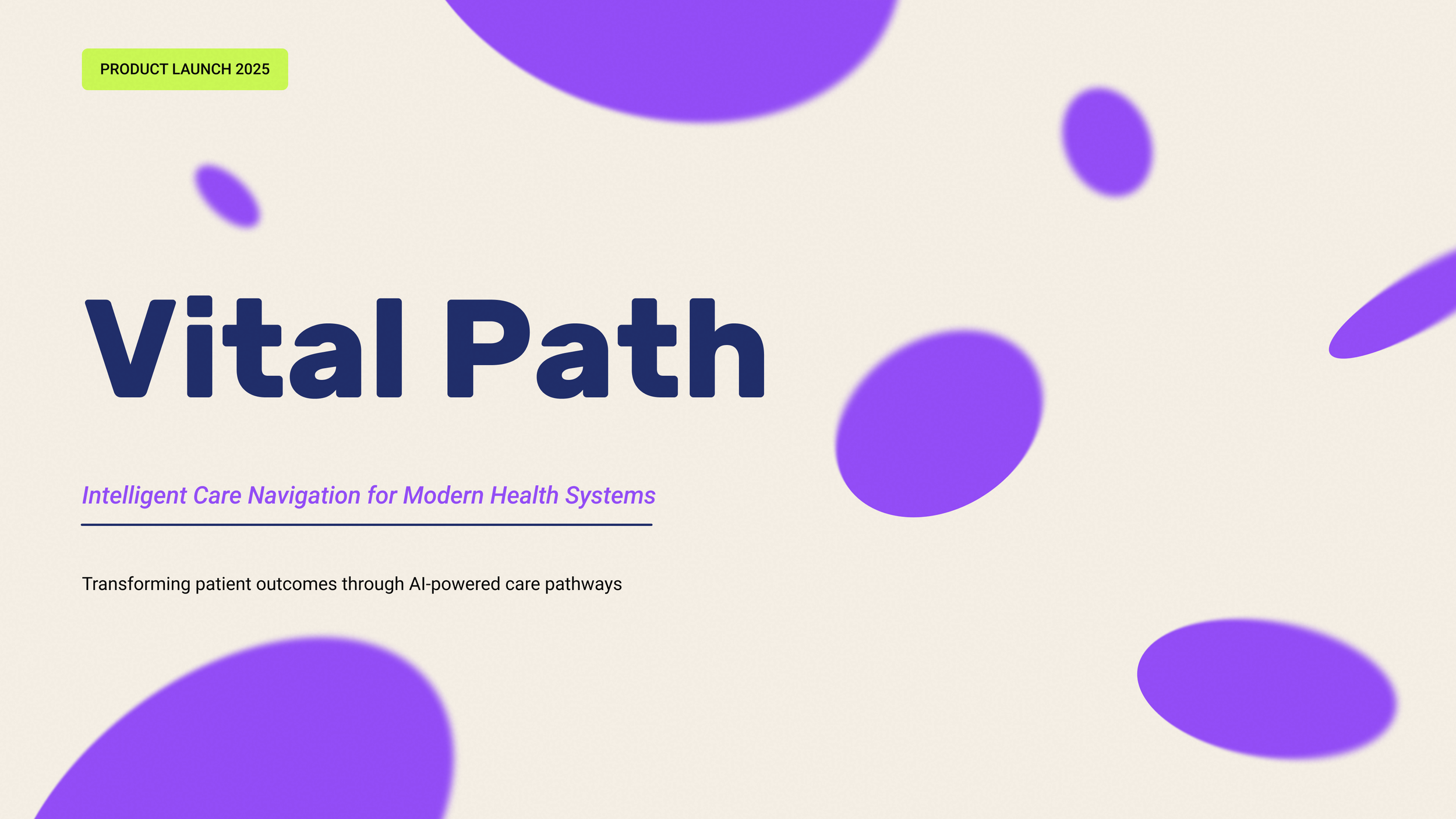
Brand launch presentation for a fictional AI-powered care navigation platform targeting U.S. health systems.
Presentation Design • Infographic Design
The Challenge
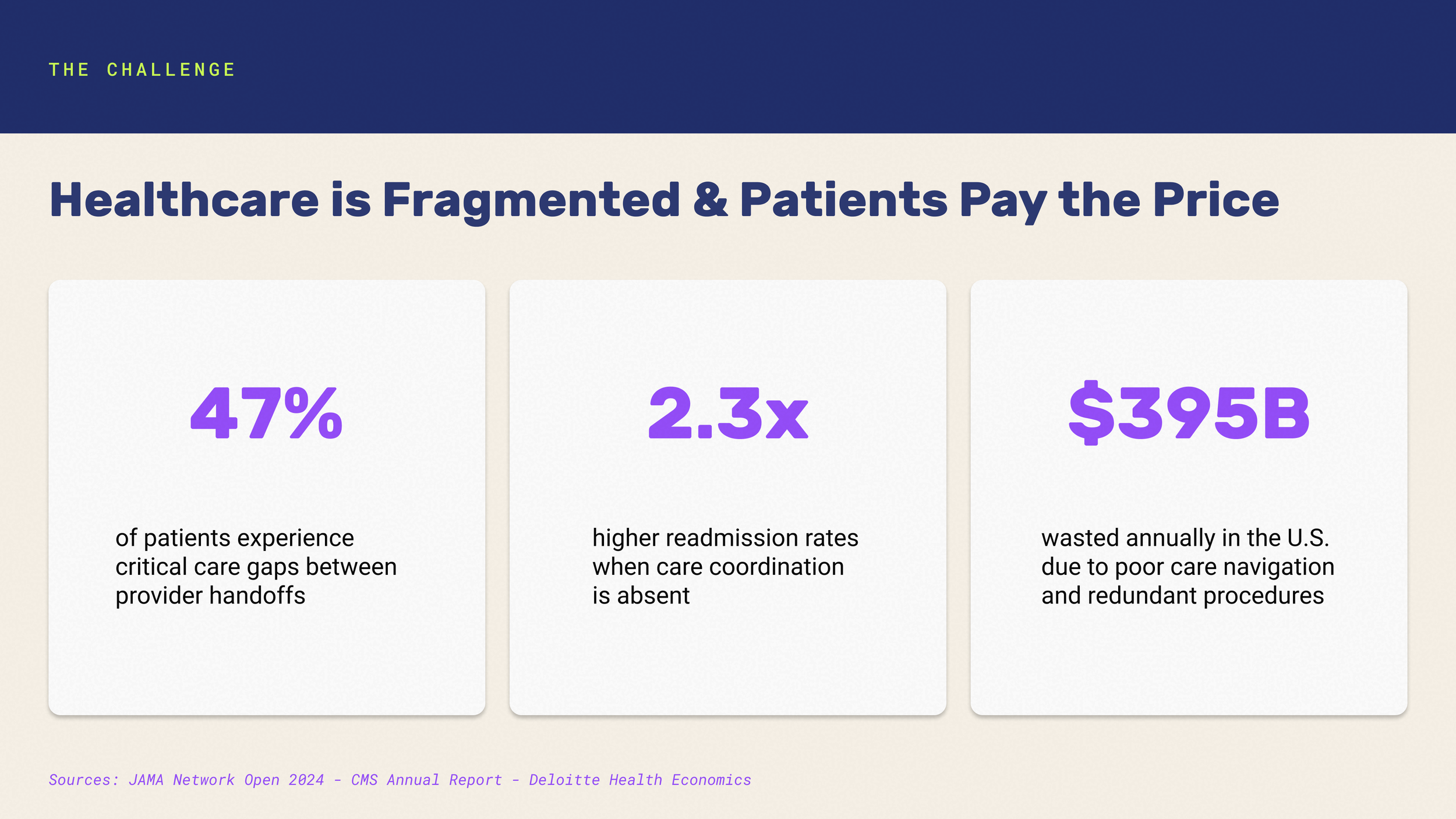
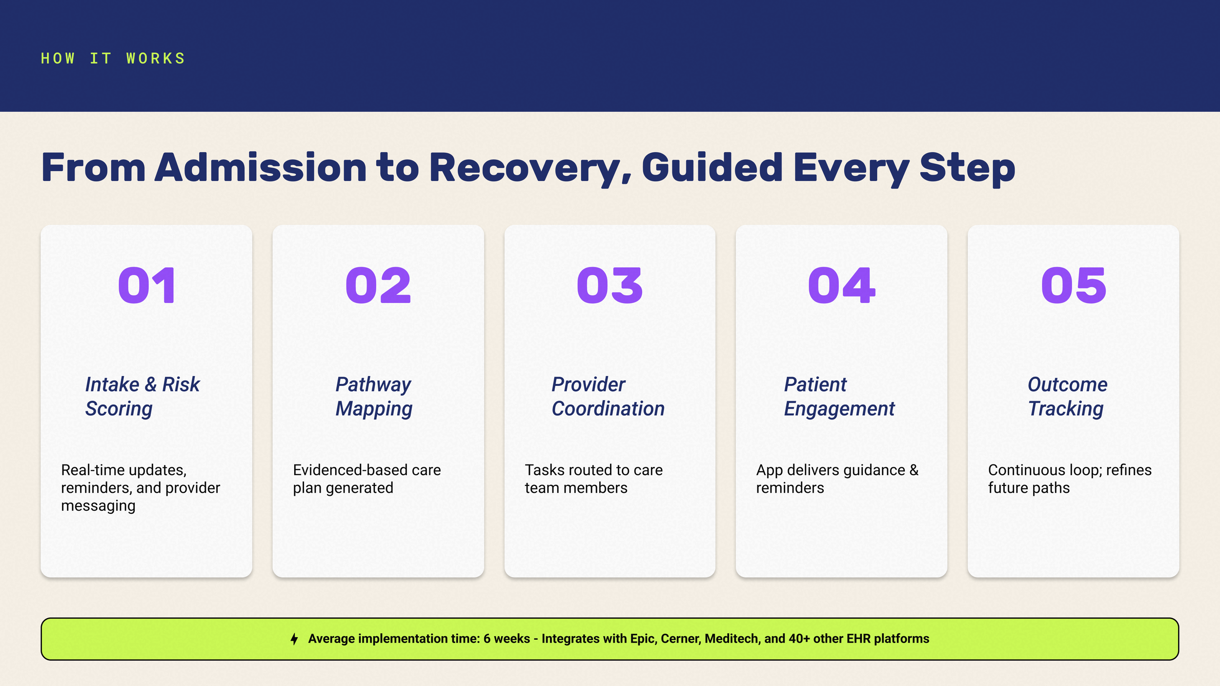
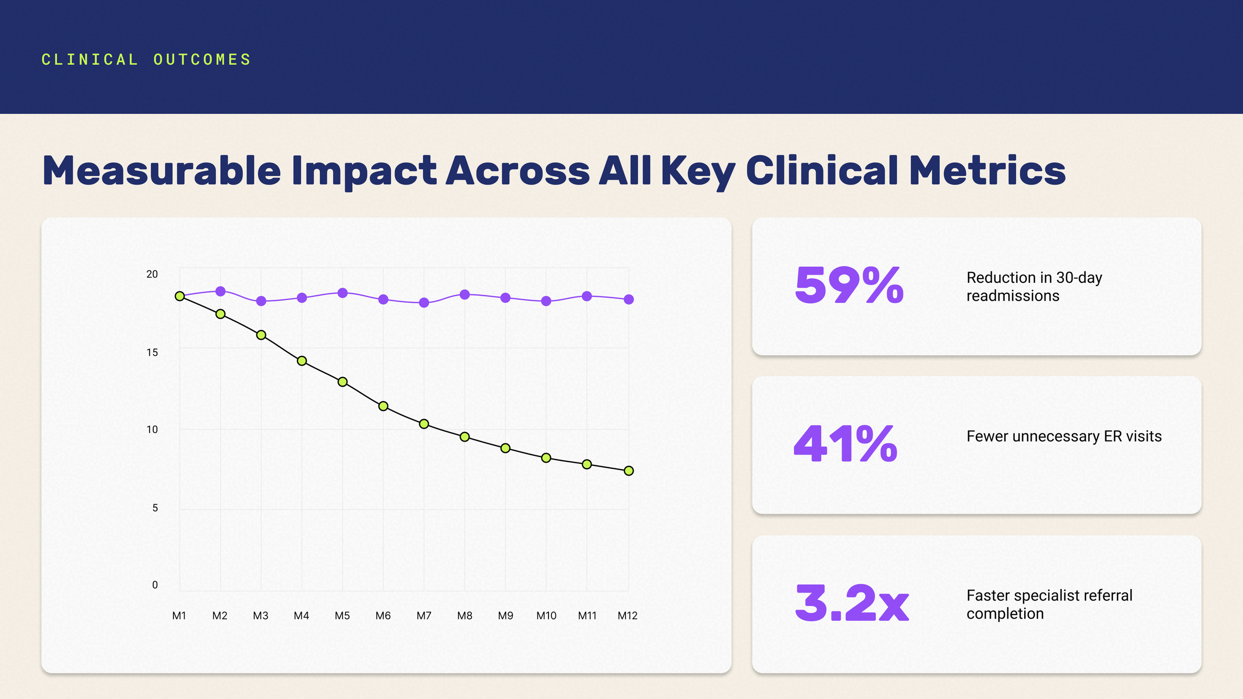
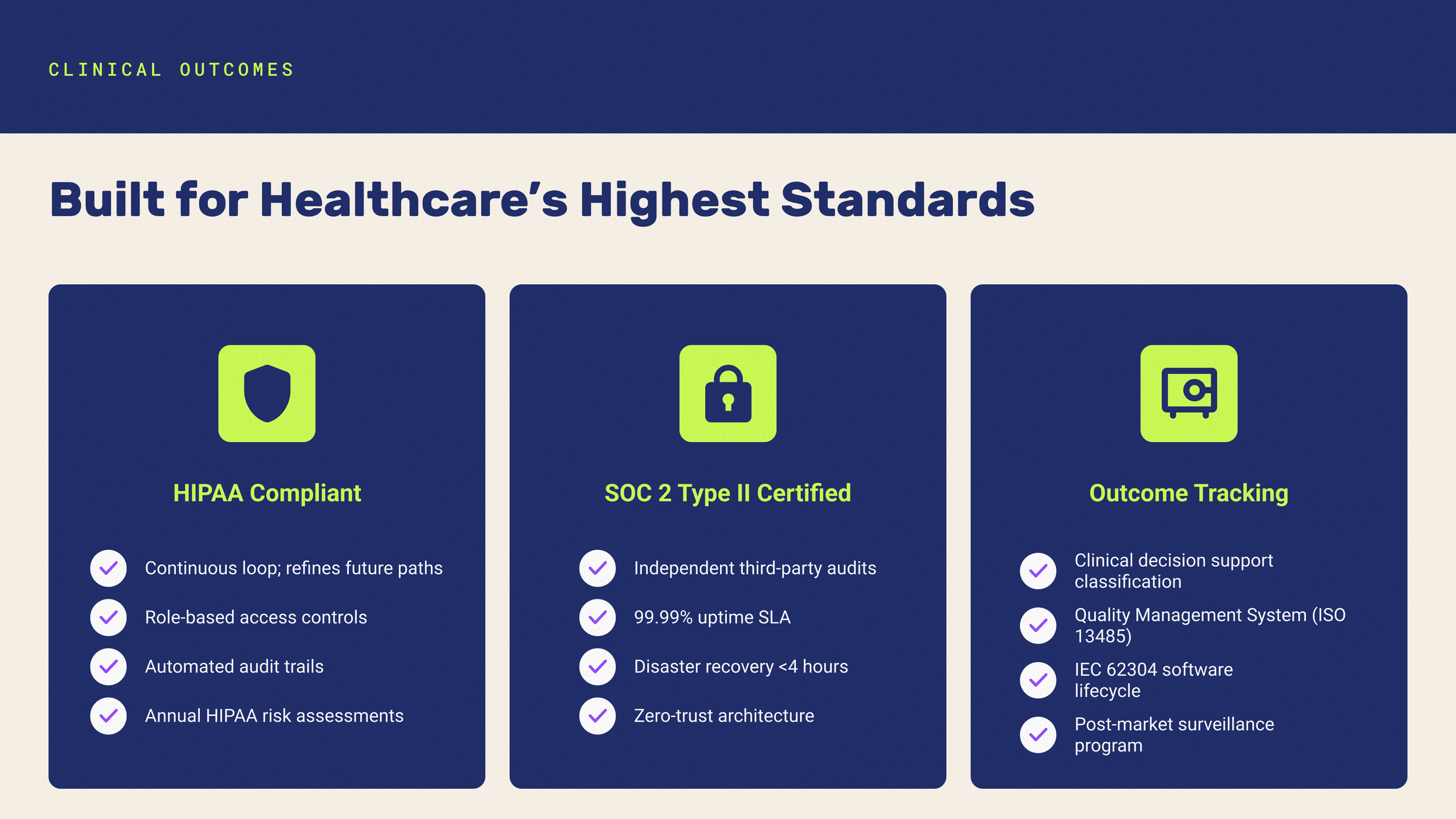
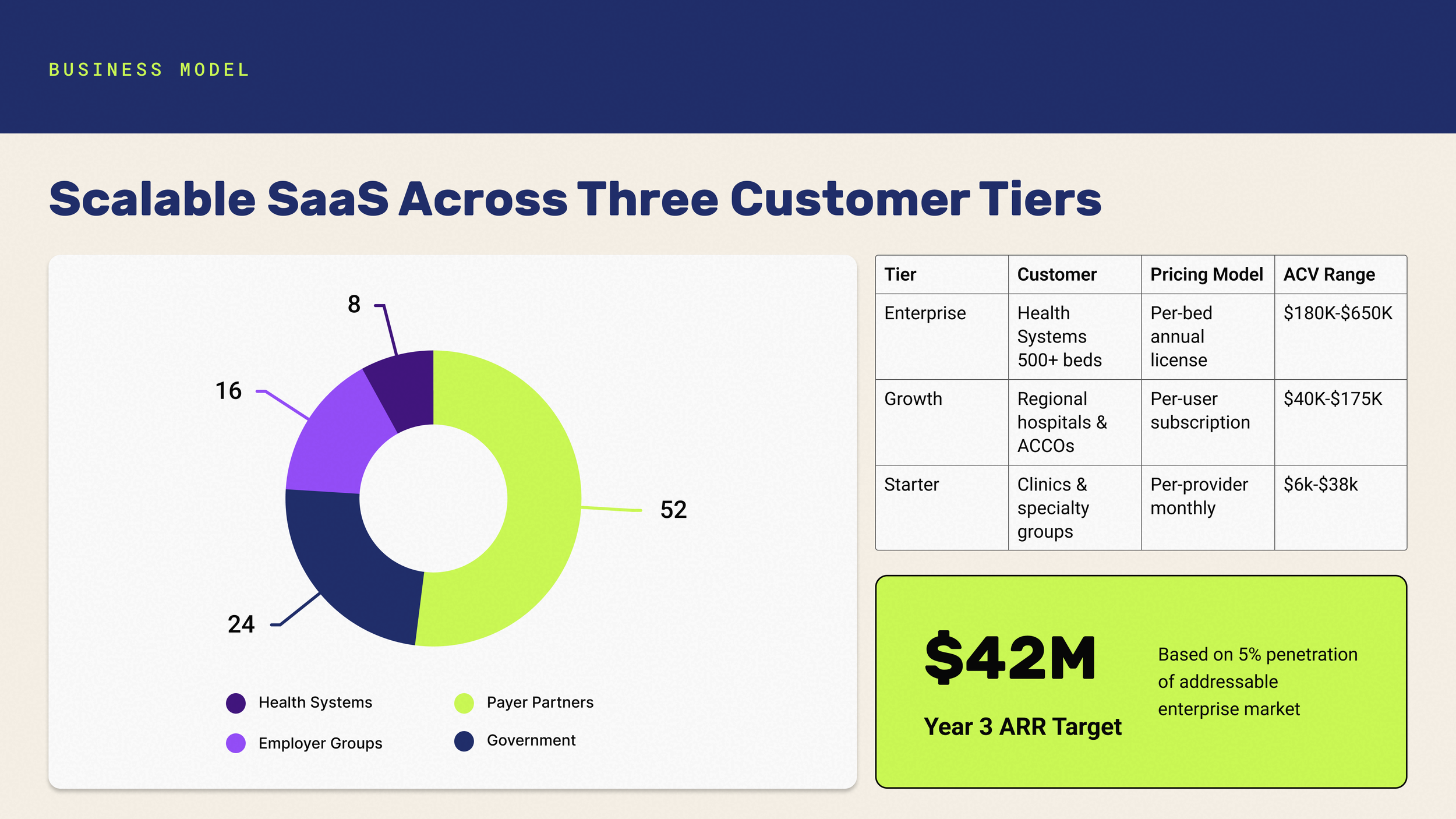
Healthcare audiences are skeptical of visual flash without substance. The design needed to communicate complex clinical and financial data clearly while still feeling premium — not clinical-sterile, not tech-startup generic.
The Insight
A key turning point in the project was recognizing that accessibility wasn’t optional — it was essential. From color contrast to text legibility, every chart and infographic needed to meet accessibility standards, particularly for audiences viewing the deck remotely or on varied devices.
This guided every design decision, from color palette choices to chart labels and font sizes.
The Approach
Anchored the identity in a deep navy and teal palette — conveying trust and innovation. A Cambria/DM Sans type pairing balanced editorial weight with functional readability across dense data slides.
Decisions
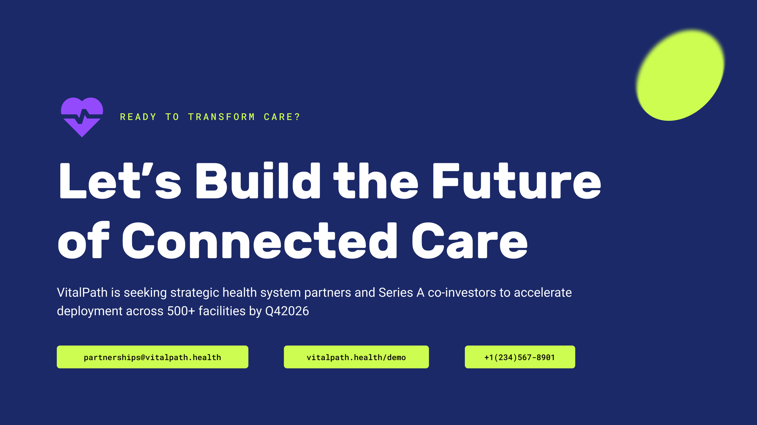
Established a "sandwich" structure — dark cover and closing slides bookend lighter content slides to create rhythm and memorability.
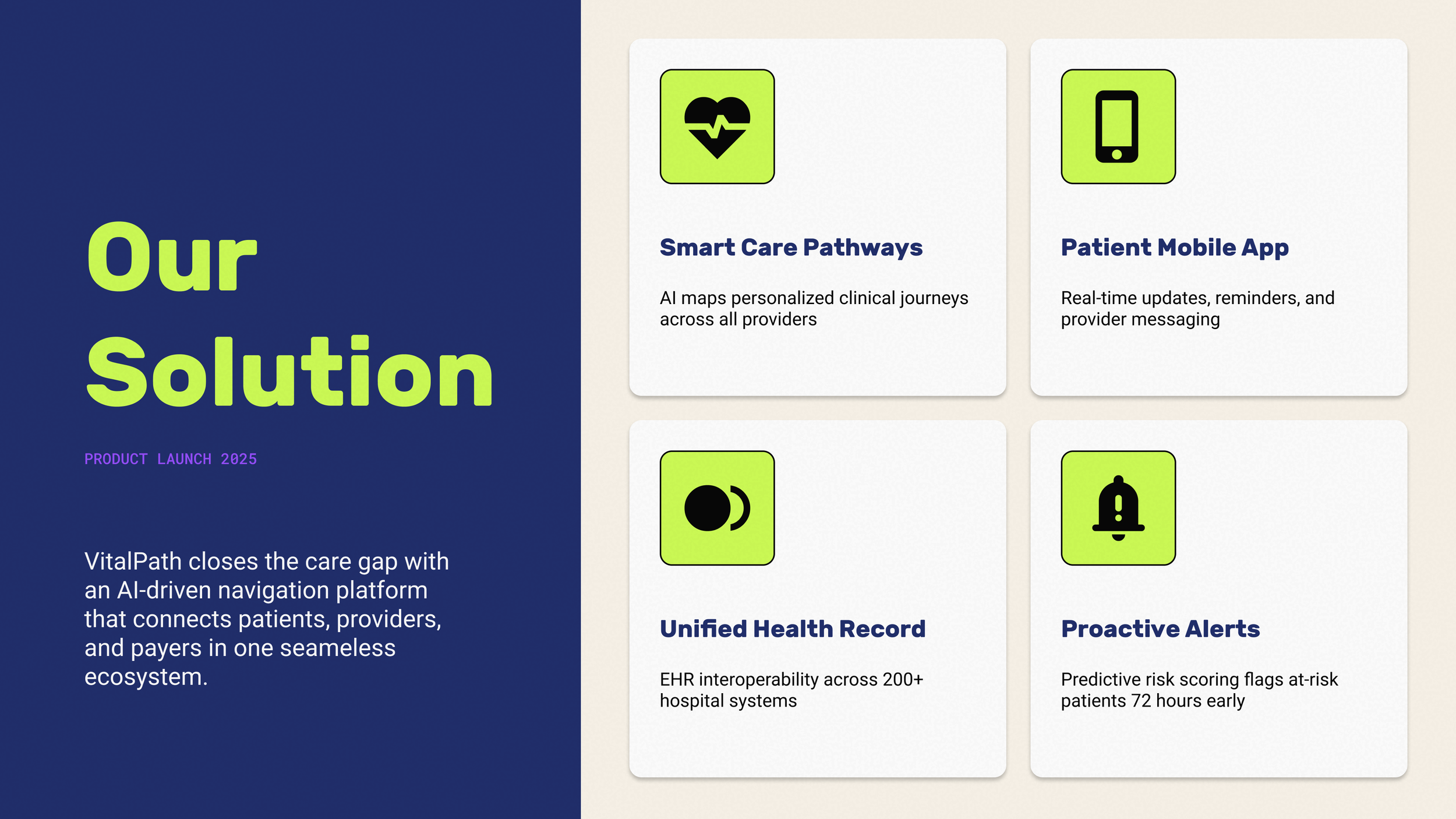
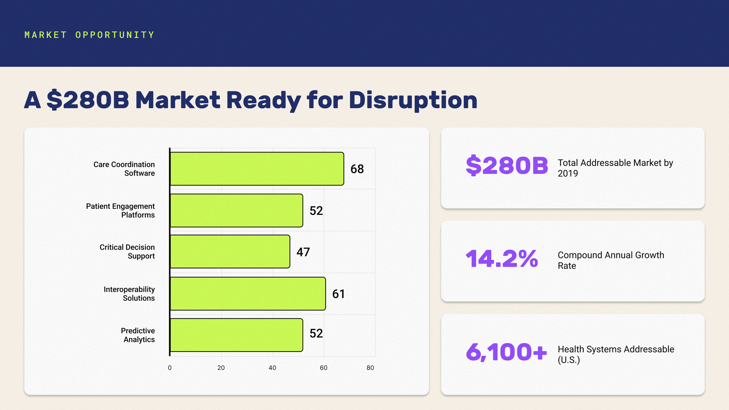
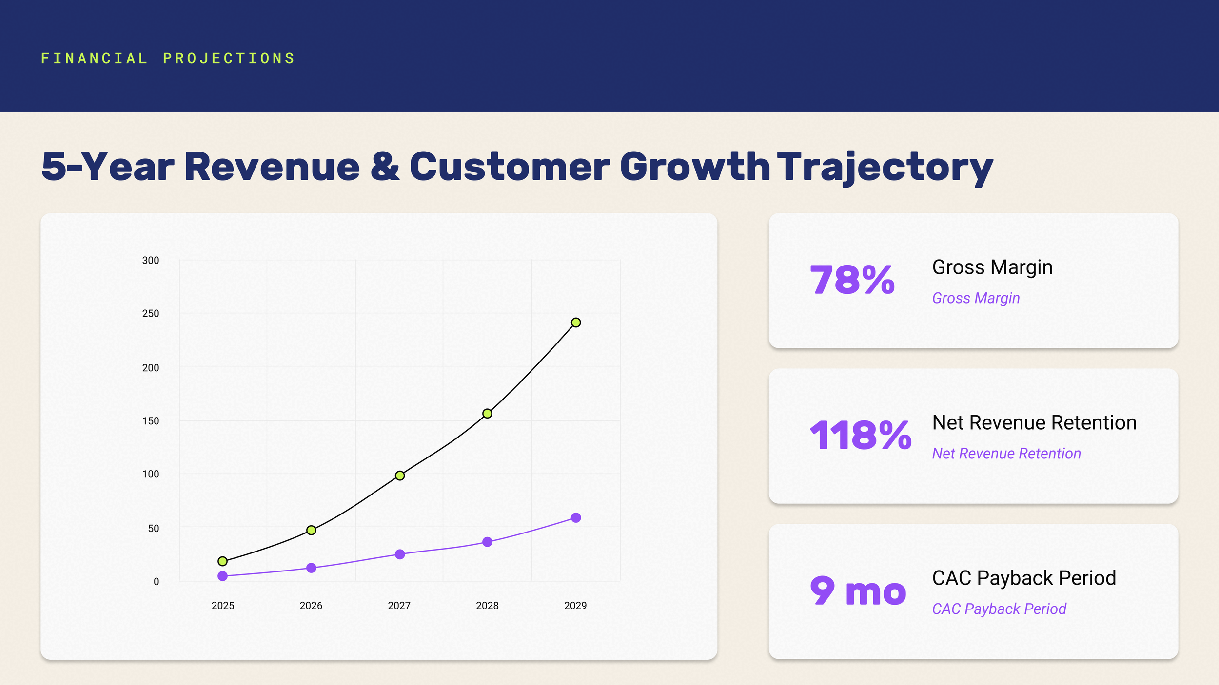
Designed a consistent stat-callout card system used across market, outcomes, and financial slides for visual coherence.
Used combo chart (bar + line, dual axis) for financial projections to show both ARR growth and customer expansion on one canvas without clutter.
Generated a cohesive data narrative — every chart and callout number cross-references the others (CAGR, market size, readmission reduction, ARR target).
What I Learned
Building visuals that are brand-aligned but not restrictive was a design balancing act. I learned to plan for flexible graphic systems that maintain consistency while still feeling fresh — and to treat accessibility as a design opportunity, not just a constraint.