NovaWell – Annual Report Summary Deck (2024)
Presentation Design • Infographic Design


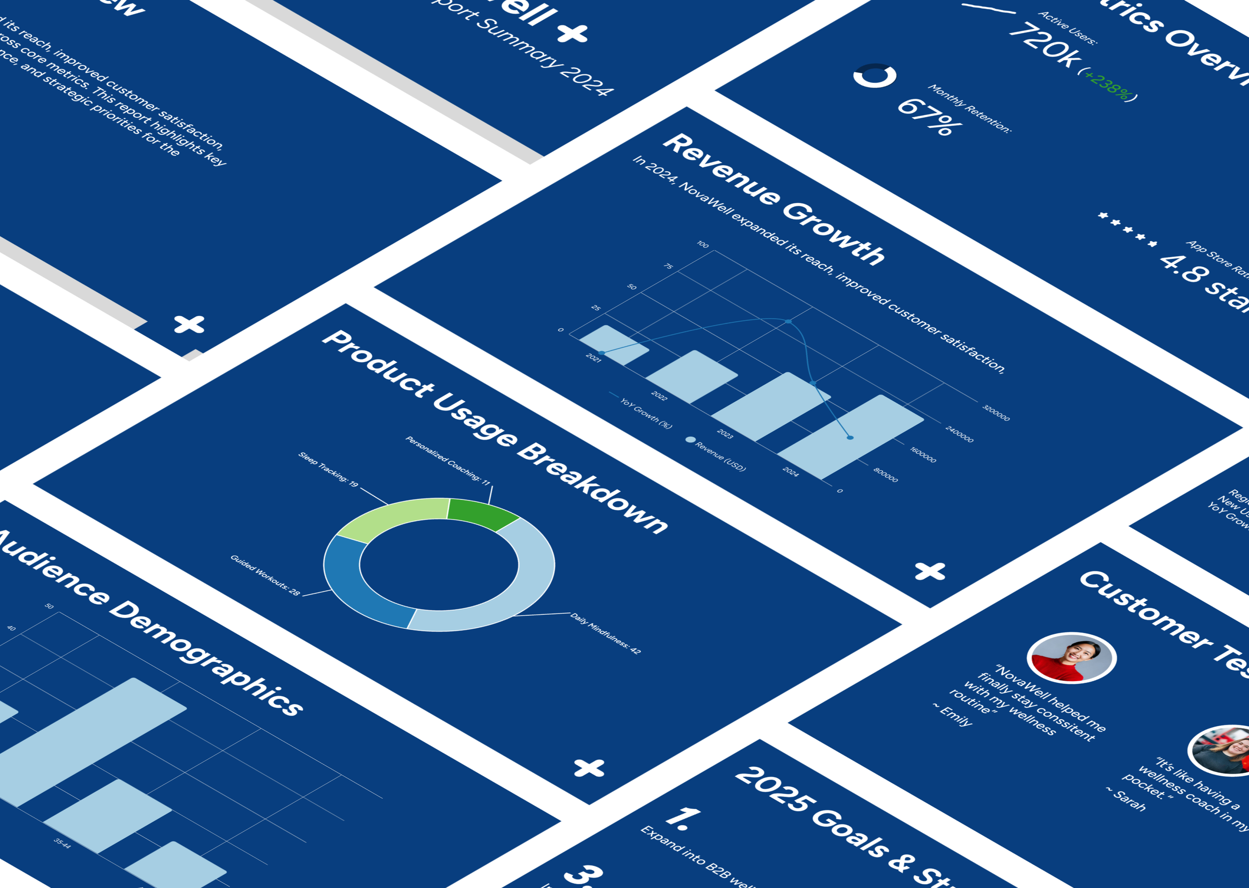
The Challenge
NovaWell needed a refreshed, modernized version of their Annual Financial Report presentation — one that remained compatible with PowerPoint, adhered to strict brand guidelines, and translated dense financial data into engaging, clear visuals.
The goal: Make complex data beautiful and accessible for a broad internal audience, without sacrificing brand consistency or readability.
The Insight
A key turning point in the project was recognizing that accessibility wasn’t optional — it was essential. From color contrast to text legibility, every chart and infographic needed to meet accessibility standards, particularly for audiences viewing the deck remotely or on varied devices.
This guided every design decision, from color palette choices to chart labels and font sizes.
The Solution
I led the redesign from start to finish, reviewing past annual reports and reimagining them through a cleaner, more engaging lens. Key updates included:
Modernized slide layouts to reduce visual noise and increase clarity
Branded infographics that felt cohesive with NovaWell’s visual identity
Accessible data visualizations, using clear labeling, contrast-safe palettes, and intuitive iconography
Delivered in PowerPoint-ready format for easy use by the internal team

The Impact
Positive feedback from internal teams who appreciated the clarity and polish
Presenters found it easier to walk through the deck, citing the visuals as “engaging without being overwhelming”
Created a template system that can be reused for future reports
What I Learned
Building visuals that are brand-aligned but not restrictive was a design balancing act. I learned to plan for flexible graphic systems that maintain consistency while still feeling fresh — and to treat accessibility as a design opportunity, not just a constraint.