

Streaming Wars Article
Comparing User Preferences: Apple TV vs. Disney+
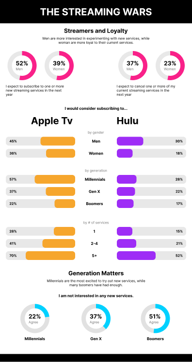
Problem Statement:
The challenge was to create an engaging infographic to accompany a press release that visually represented the user preferences for subscribing to either Apple TV or Disney+. The infographic needed to highlight distinctions among different user segments, including gender, generation, and the number of current streaming services they subscribed to.
My Role:
I was responsible for the end-to-end design and creation of the infographic, including research, data visualization, and graphic design.
Process:
1. Research and Data Collection:
- Conducted research to identify relevant data sources and statistics.
- Gathered data on user preferences, demographics, and streaming habits.
2. Information Architecture:
- Structured the information to make it easily digestible for the target audience.
- Divided the data into categories such as gender, generation, and the number of existing streaming subscriptions.
3. Data Visualization:
- Created compelling visualizations, including bar charts, pie charts, and icons, to represent the data effectively.
- Ensured consistency in the use of colors and icons to maintain a cohesive design.
4. Design and Layout:
- Developed a clean and visually appealing layout for the infographic.
- Incorporated user-friendly typography and graphics to enhance readability and engagement.
5. Iterative Design and Feedback:
- Collaborated with the PR team and stakeholders to gather feedback on the initial design.
- Made revisions based on the feedback to refine the visual representation.
6. Final Review and Approval:
- Conducted a final review to ensure accuracy and cohesiveness in the infographic.
- Obtained approval from the PR team and relevant stakeholders.
Results:
The infographic successfully met the project's objectives and provided the following outcomes:
- Enhanced the press release's visual appeal and engagement.
- Clearly communicated the distinctions in user preferences between Apple TV and Disney+ across various user segments.
- Received positive feedback from both the PR team and the audience.
Lessons Learned:
This project reinforced the importance of data visualization in making complex information accessible to a broader audience. It also highlighted the significance of collaboration and iterative design in creating effective communication materials.
Key Takeaways:
- Effective data visualization can significantly enhance the impact of information.
- Collaboration with stakeholders and obtaining feedback is crucial for refining the design.
- Maintaining consistency in design elements is essential for a cohesive presentation.